

In many ways, PRIXEL Mono brings the idea of PRIXEL full circle, back to the rubber stamp label kits that inspired it. This post takes a look at the prototypes, manufacturing challenges, and typography considerations that shaped Mono's development over the last 10(!!!) years.
Background

As far back as 2006, long before PRIXEL was even an idea, I was experimenting with rubber type and hand stamping as a design student. I loved the physicality of stamps: the compactness, accessibility, and how typography could function as both language and form. I loved the honest variation in it, the way the same letter would make a slightly different mark each time.


Most rubber type kits are basically tiny versions of movable type. You use tweezers to pick and place the letters, which makes for a tedious typesetting experience.

Sometime around 2011, I saw prints by Sam Cox and Justin LaRosa of Physical Fiction, who made some incredibly complex, multi-color prints using LEGO tiles.


I also came across Fregio Mecano, Alpha-blox, and other modular letterpress type systems. And the work of Jennifer Farrell of Starshaped Press, a contemporary printer who makes extensive use of letterpress ornaments.
All these influences stewed into an obsession with making a printing system that could interchangeably be used as stamp or on a printing press. Something that felt playful to use like a toy but was a competent printmaking tool in its own way.


At the time, I was convinced that business cards would be a good test use case for defining the grid size of this system. LEGO’s 8mm grid wouldn’t leave much room to typeset an email address or even a phone number on a business card. Interestingly, in the 1970s, LEGO had produced a product called Modulex for architects and urban planners that used a 5mm grid. This seemed like a good place to start.


In 2012, the first prototype was made with laser cut rubber glued to Modulex bricks. But the tile pieces were virtually impossible to remove without a prying tool. To me, the prying tool undermines the satisfying feel of building with LEGO. It was like tweezers all over again.


In 2016, after a few more years of experimentation, I landed on the stud and hole design that PRIXEL still uses. By extending the studs out the back of a setup plate, you could remove any piece just by pushing it out with a fingertip.
Now it was time to revisit typography.
PRIXEL Mono Version 1

Once the stud and hole design was settled, I set to work on making molds for other shapes, including a typeface. I bought one of the first generation of user-friendly desktop CNC mills that came out in the mid-2010s and made tons of molds.

CNC mills use special drill bits called end mills that are designed to cut laterally instead of vertically.
There’s a whole category of typefaces designed for this production method. They’re variously called stick fonts, single line fonts, engraving fonts, plotter fonts, etc. Instead of trying to emulate Courier, Helvetica, or some other common typeface, I decided to embrace the production method I was using and design a square, mono width typeface with a single centered line, whose width would be defined by the diameter of the end mill I used.

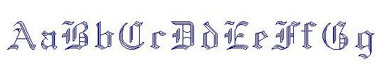
But I’m not a typographer, so I needed a reference. Googling something along the lines of “monolinear and monowidth font with ball-end terminals,” I stumbled on a project by Andrew Bellamy. He had designed several complete typefaces based on vintage Canon camera body engravings. One of them, 61-PLR, was almost perfectly square.

I redrew a type sample as a stick font and made some tests.

When I was getting ready to sell the first PRIXEL kits in 2021, I reached out to Andrew to see if he was ok with me using it. Thankfully, Andrew was excited about making a "typeface you can drop on the floor" and agreed to fix all my janky typography work and turn it into a proper digital typeface.

I milled the molds for these out of tooling board, a special kind of high density plastic. They’re great for making quick molds for low volume casting. For soft materials like RTV (Room Temperature Vulcanizing) silicone, they can last for years. I was still using some of the molds I’d made in 2016 when I stopped producing kits by hand in 2022.

We had to make some adjustments to the letter designs when we found that tiny counters had a tendency to break off the mold.

Andrew redesigned certain characters to account for this, notably A, $, @ and #.
Production/Manufacturing


The original process of casting, demolding, and sorting these letters into trays was incredibly time consuming. It took about 2 hours of labor to produce a single set of type and sort it into the kit trays.

With production by my factory partner in China, PRIXEL pieces are cast in a single sheet and the pieces are separated by hand. It's much less labor intensive, but still too difficult to track precise quantities of 50+ different characters and keep them organized.
PRIXEL Mono would need to be produced as a single unit that the end user could sort themselves.

Before beginning contract manufacturing in 2023, I had experimented with a small die cutting tool to make a set of 1x1 square PRIXEL pieces.

Die cutting, which uses thin pieces of sharpened steel rule hammered into plywood forms, can achieve 0.1-0.3mm accuracy. But when printing, inconsistencies as small as this in the width of a square are quite noticeable, which is why this manufacturing direction was abandoned.

However, if the shape was all sufficiently inset, the variability wouldn’t be an issue, because the printable area wouldn’t be affected by the cutting process.

This led me to design the type sheet as a square. It’s cut in two passes by a die with straight rows. The first cut is made, then the die is rotated and a second cut is made. Foam in-between the blades prevents the sheet from getting stuck. The part with pins is used to eject the sheet from the die after cutting.
Organization

PRIXEL shape pieces, with a couple exceptions, all shapes of the same size have different colors, making them easy to distinguish at a glance. But it was unrealistic to assign each of the 50+ Mono glyphs a different color.

With the original kits, I organized the glyphs into a tray with 18 compartments by hand. It took me and a couple friends about 15-20 minutes per kit—and that set only had 256 letters, not 324. Asking anyone to hand sort these again was a nonstarter.
Moreover, since the letters aren’t distinguished by color, it’s annoying to find the “A” in the “ABC” compartment, much less the single “#” in a compartment with 8-10 other pieces of punctuation. But making 30+ compartments was going to make the packaging too large.

I thought an organizer sheet would be a good alternative. I prototyped a laser cut one out of chipboard. I like chipboard because you can easily mark it with labels via screenprinting or laser etching, and it's a sustainable material. But the problems were threefold: chipboard wears with repeated insertion/removal of pieces, thick chipboard is very difficult to cut small holes in with a die, and laser cutting leaves a residual smell.

Ultimately, I landed on an EPDM foam sheet. I'm always hesitant to choose non-biodegradable materials, but I consider them when they're an integral part of the product that's intended to be reused. Foam doesn't lose its tightness over time, and it's lightweight and relatively easy to cut.
Unique Typeface Features

Aside from the manufacturing and product design challenges, I worked closely with Andrew to make a typeface design that would take advantage of its unique ability (for a Latin typeface) to rotate 90°.
Substitution

When you have a fixed number of letters, typesetting can become an exercise in scarcity. However, since Mono characters are all square, certain forms lend themselves to being substituted for other forms when rotated for some added flexibility.


At the same time, we didn't want to become so idiosyncratic that the letters scream “this was dEsIgNeD!” Or worse, are ambiguous—is that a 2 or a Z? Like most well designed things, a good typeface should be a little “invisible."

In the end we ended up with 10 character substitutions. The only compromise to legibility is that there is no distinction between "O" and "0", so we recommend not using Mono to print your wifi pa$sw0rD!
Diacritics

I wanted to find a way to support the expression of other common Western European languages. But with limited pieces, I also didn’t want to create unique accented characters that would only get used by a small subset of customers. I had the idea of using the diacritic marks as standalone pieces that you could “stack” to create accented characters. In some cases, like the colon and umlaut, this was an amazing fit with the substitution-rotation feature.

We did a lot of research on letter frequency between different languages, as well as the minimum accents required to support a given language. In the letterpress world, this is called fonting.

The accents are placed above the character to be modified. Stacking to “build” an accented character feels totally in line with the PRIXEL. It brings a bit of construction into the typesetting process.

And best of all, it means that there are all these special shapes that can be used the same way other PRIXEL shape pieces are used—as little atomic drawing bits.
What’s Next

The final version of Mono includes 324 glyphs: letters, numbers, punctation, and support for multiple languages.
Still, even after all the revisions, Mono still feels like a work in progress.
There are things I want to improve:
- Cleaner piece separation
- Piece fit (feels looser than other PRIXEL pieces)
- Sharper printing type
- Foam organizer production issues
- Revised booklet
And many type directions I want to explore:
- Serif, script, chonky, and other style variants
- Wider (1×2) or taller (2×1) variations
But that iterative open-endedness is kind of the point. PRIXEL feels less like a physical product and more like software sometimes.
If you read this far, you’re a legend. Thanks for following along :)
🟨🔵🔺
Brandon
Many of the nice-looking graphics on this post are courtesy of Andrew Bellamy. See his writeup on the original PRIXEL Mono on his website, Otherwhere Collective.